You are here
Home › Comics › Yipes! Swipes? Indie Comics Artists Seeing Their Work in Unexpected Places ›Yipes! Swipes? Indie Comics Artists Seeing Their Work in Unexpected Places
FTC Statement: Reviewers are frequently provided by the publisher/production company with a copy of the material being reviewed.The opinions published are solely those of the respective reviewers and may not reflect the opinions of CriticalBlast.com or its management.
As an Amazon Associate, we earn from qualifying purchases. (This is a legal requirement, as apparently some sites advertise for Amazon for free. Yes, that's sarcasm.)

Swipes. It's a slang term that can sometimes mean 'homage' and sometimes mean 'plagiarism.' In the comic book industry, it generally refers to an image, most frequently the cover image, where the artist relies on a previously published work as a reference. Most times this is done without the intention of hiding anything -- artists appreciate other artists, and they will usually sign their name to the finished piece with "after Other Artist" to pay their respect. And sometimes, and more rarely, it's just done for expediency, without attribution just so the job gets done. Comic artist Greg Land gets discussed a lot when the comic shop conversation turns to swipes, having frequently used published photos of models and even other artist's works (like this ALIENS piece discussed here).
Usually, the swipe is obvious, and often it's from another well-known (or at least mainstream) peer in the industry.
But lately independent artists have begun questioning whether or not their own works have begun influencing their more fortunate counterparts in the mainstream.
Talking to a friend.
Punchline vs. DC's Punchline and Soulfinder vs. DC's Soul Plumber.
Coincidence? Totally innocent? Or something more? pic.twitter.com/MrhsfefASV
— Douglas Ernst (@douglasernst) August 15, 2021
Douglas Ernst, columnist for the Washington Times and creator of the graphic novel series, Soulfinder, pointed out some simllarities over at DC to one of his covers. "Talking to a friend. Punchline vs. DC's Punchline and Soulfinder vs. DC's Soul Plumber. Coincidence? Totally innocent? Or something more?" The tweet contained four images -- two from independent books, two from DC, that showed superficial similarities to each other.
 |
 |
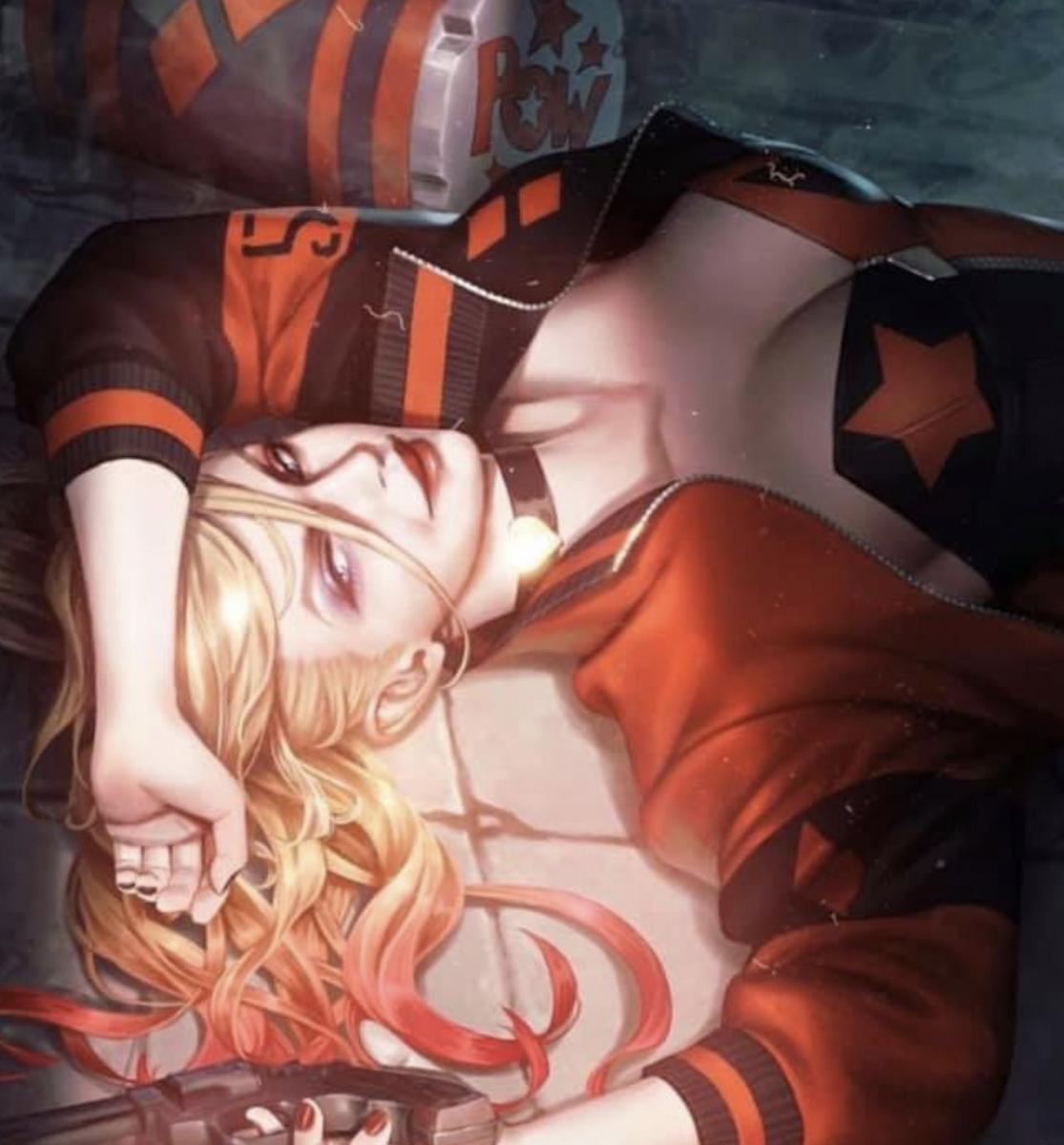
| Antarctic Press's Punchline #4 cover by Matthew Weldon | DC's Suicide Squad #1, cover by Woo Chul Lee |
The first comparison was from an image of Antactic Press's Punchline #4, with art by Matthew Weldon. The scene showed the main protagonist of the series laying on the floor with her hair splayed about her. In contrast to this, we see DC's Suicide Squad #1, a variant cover done by Woo Chul Lee, featuring Harley Quinn in a very similar pose. The poses are not exact, which is an argument against it being a swipe, but they are similar in enough aspects for a compelling case.
Indeed, covers don't (and shouldn't be) exact copies to be an homage or swipe. The header illustration for this article, for instance, shows a sequence of swipes that all pull from Rob Liefeld's The New Mutants #87. But even Liefeld's piece traces back to the Silver Age issue of The Avengers #145, with the Assassin in a similar pose to Cable, but the remainder of the layouts showing similarities of theme but different executions.
 |
 |
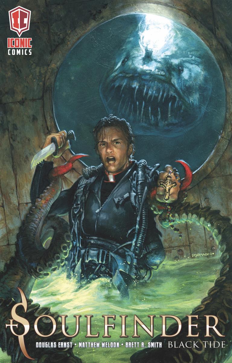
| Iconic Comics' Soulfinder: Black Tide, cover by Dave Dorman | DC's Soul Plumber #1, cover by John McCrea |
The distance between theme and execution is greater in the second set of books -- Ernst's own Soulfinder: Black Tide and DC's Soul Plumber #1. Similarities in title name aside, both covers show their characters facing front-left from the center, a strange creature behind them, the presence of attacking tentacles, and an underground setting of neon green mists. This one is far from being exact in execution, but the staging is similar enough that, when combined with the themes of the piece, an argument could certainly be made.
Two books from different indie publishers having similarities to two books at DC could absolutely be a coincidence. But later the same week, a third coincidence cropped up.
 |
 |
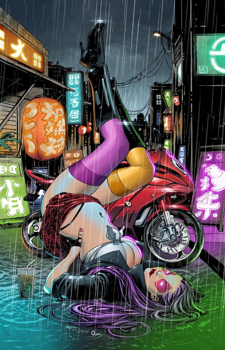
| Nyobi: Origins #1, alternate cover by Matthew Weldon | DC's Harley Quinn: Eat. Bang! Kill. Tour #1, alternative cover by Natali Sanders |
Independent comics creator Larry Higgins, whose character Nyobi has been crowdfunded through several successful issues and has made the transition over to Antarctic Press (making her first appearance in Exciting Comics #17 this October) found that the alternative cover for his latest book, Nyobi: Origins #1, currently funding on Kickstarter, bore a striking resemblance to Natali Sanders' alternate cover for DC's Harley Quinn: The Eat Bang Kill Tour #1. Curiously enough, Higgins' alternative cover was also done by Matthew Weldon. In the images, Harley's legs are in a different position than Nyobi's, and there are completely different backgrounds. However, the covers are eerily simlar to the point that, when I load them into my picture viewer and hit the right and left arrows to toggle between the two, it looks like the same figure kicking her feet.
The saying goes that once is happenstance, twice is a coincidence -- and three times is a pattern. All three of the DC covers were done by different artists, so that's certainly less damning than if the same artist had done all three. For now, let's say it's "extremely curious" and keep a watchful eye for more.


